___
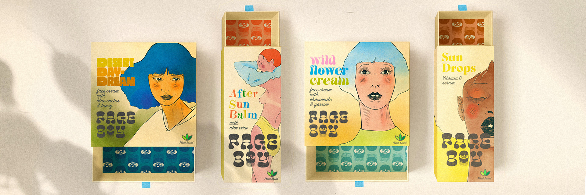
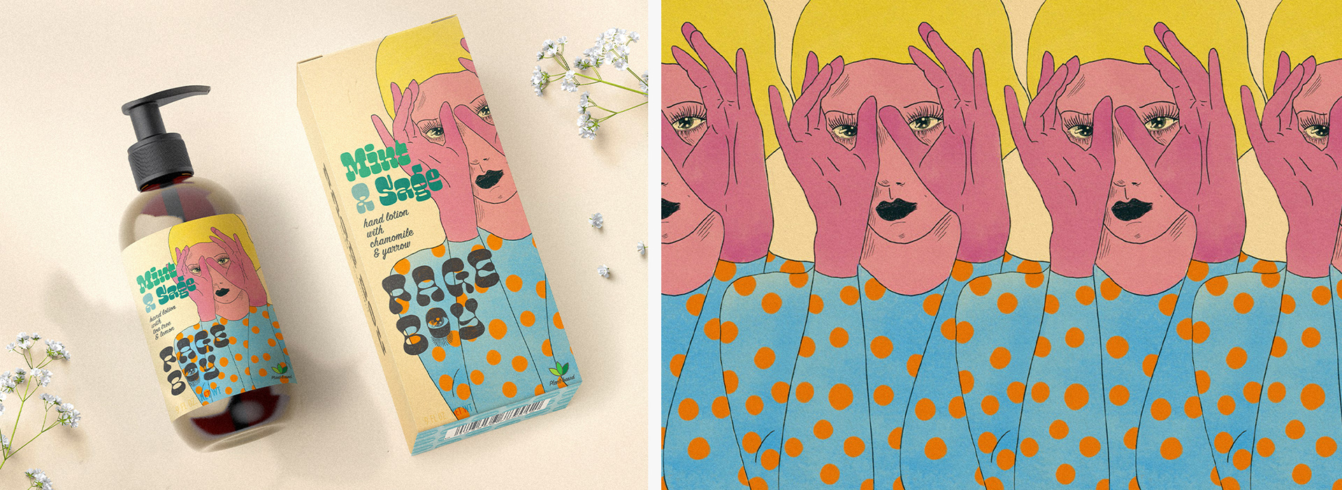
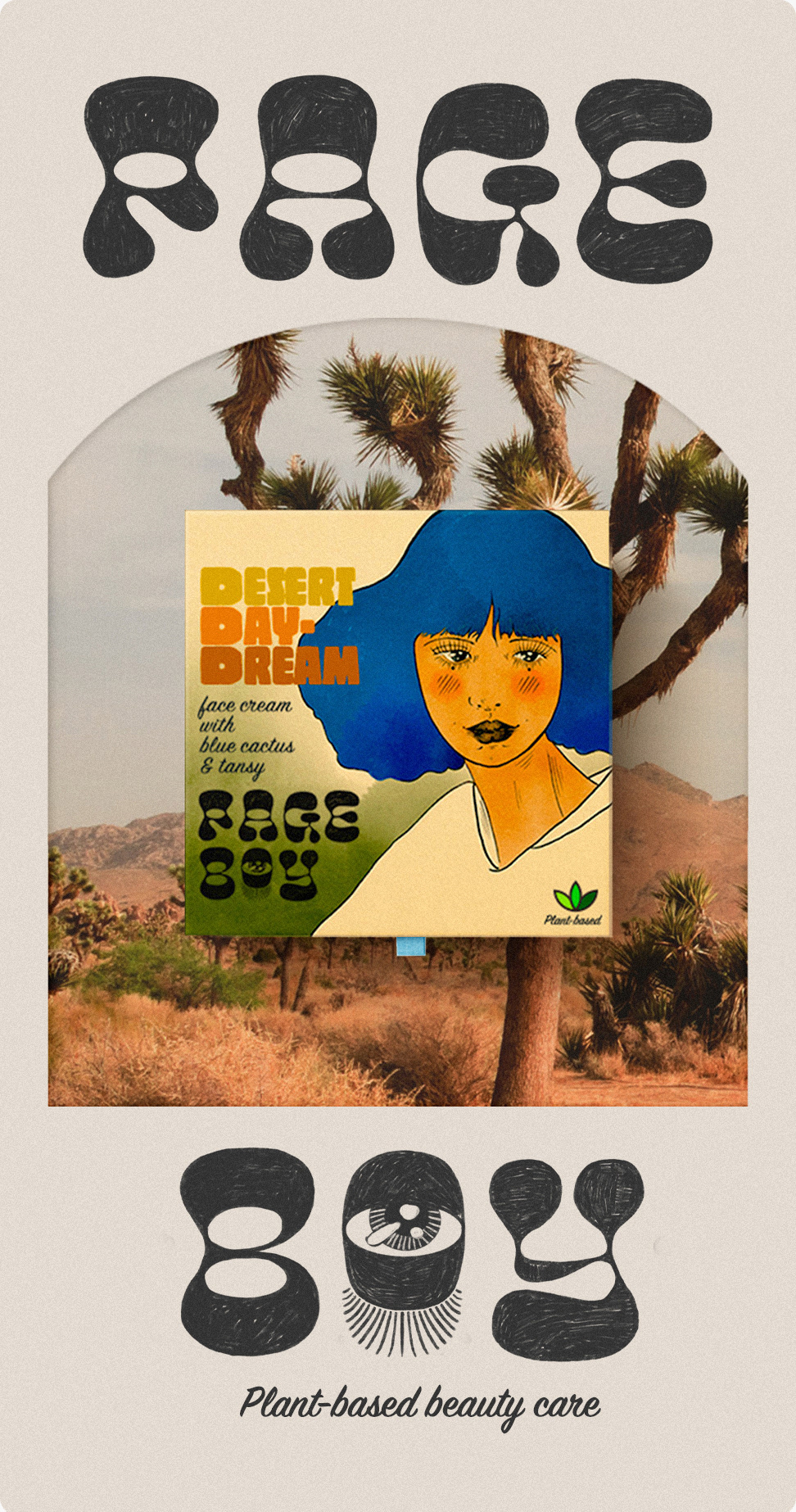
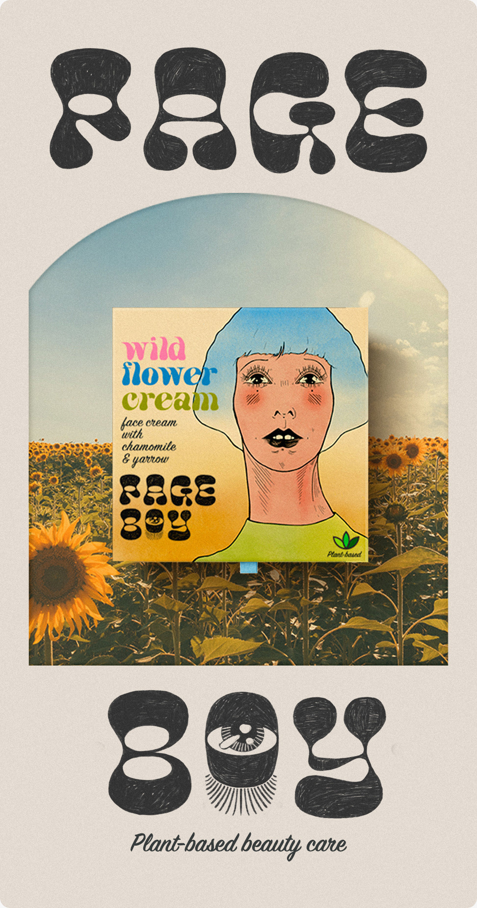
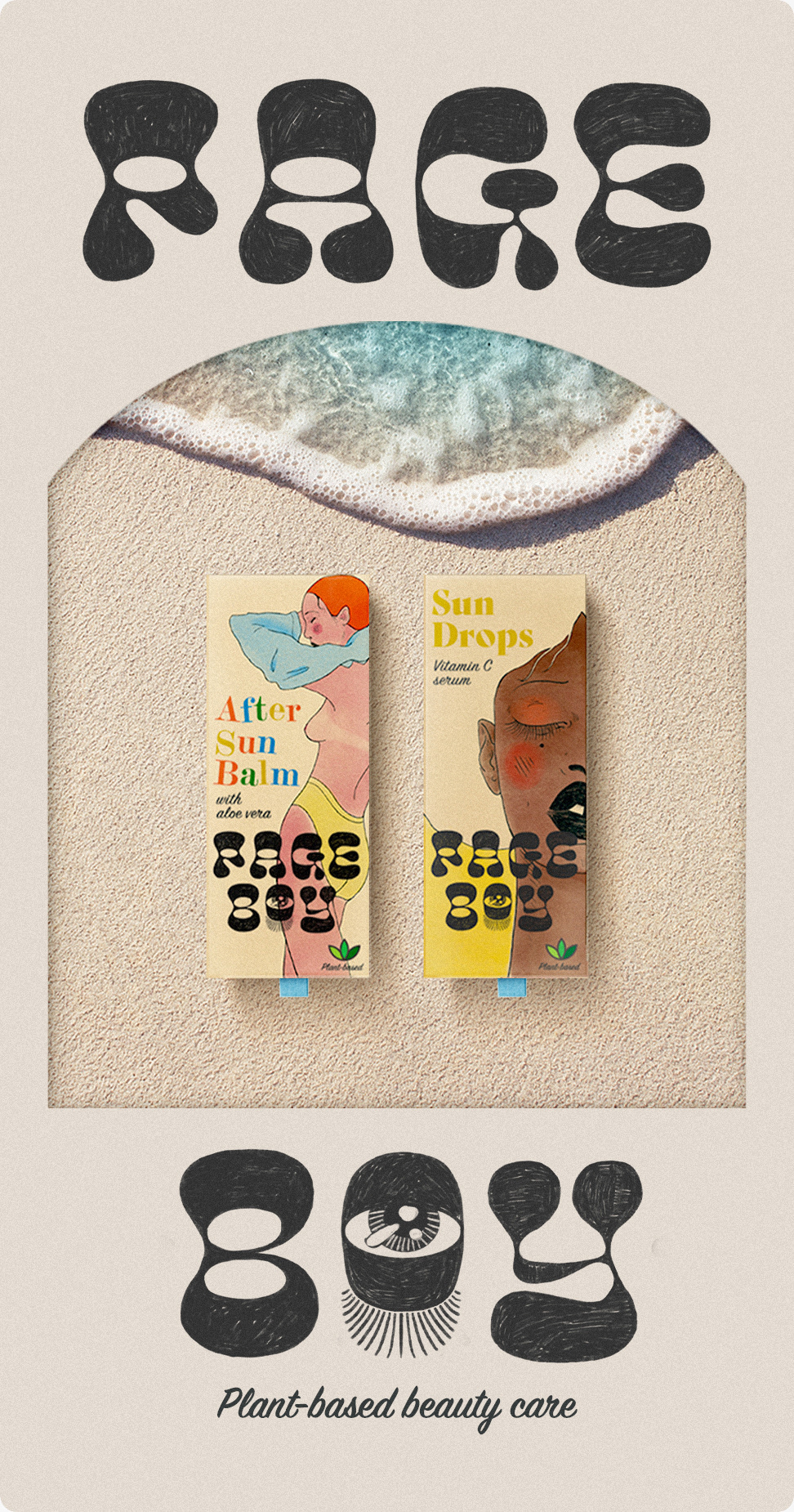
A retro-themed beauty brand, Page Boy at the root was largely inspired by the illustrator & designer Antonio Lopez who was active from the 60s to 80s as well as Teen Look–a Japanese young adult magazine. I set out to create a nostalgic brand for a small batch plant-based beauty company. I chose the name "Page Boy" as it is a favorite hairstyle of mine that was popular during the 60s.
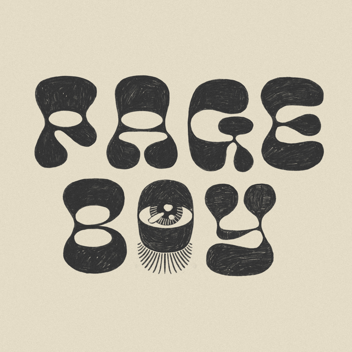

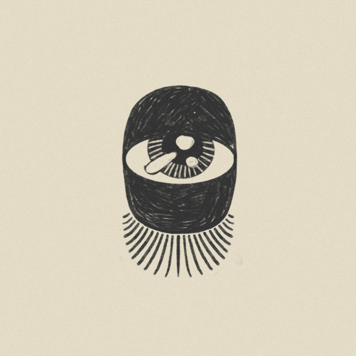
As with the other visuals, I wanted the logo and word mark to also feel in-line with the illustrations of the 60s & 70s. I didn't want it to be too refined as I wanted to fit with the sketch/illustration style of of the drawings I did for the packages, so I drew on the typeface Chee (a very retro/psychedelic font) making sure to preserve the pencil strokes. Though Page Boy wasn't necessary a makeup brand, I used the I for the letter 'O' as I felt it connected back with the then popular doe-eye makeup look.
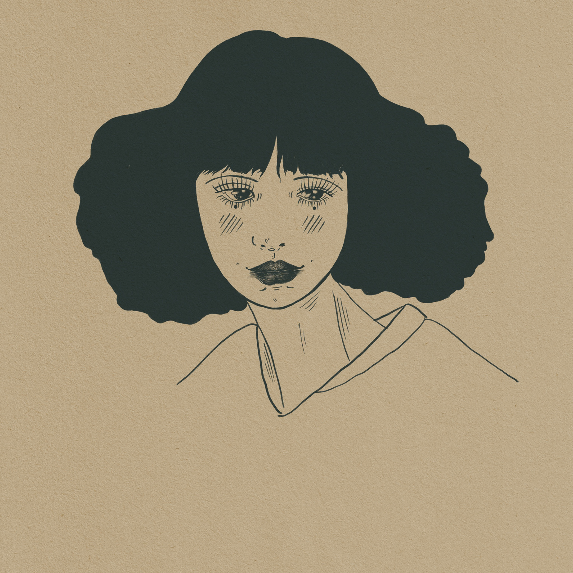
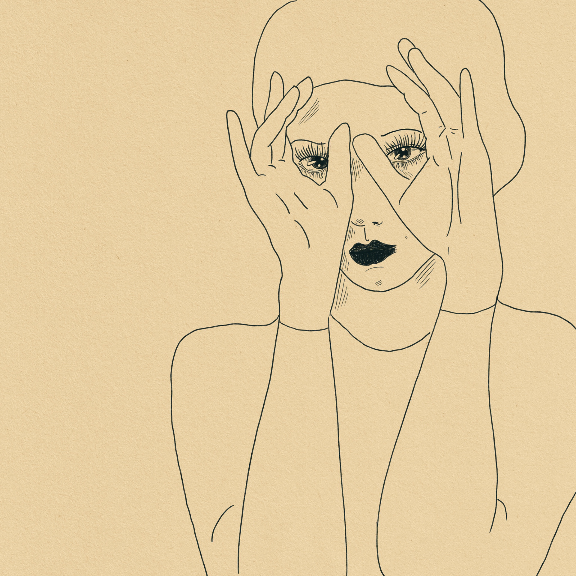
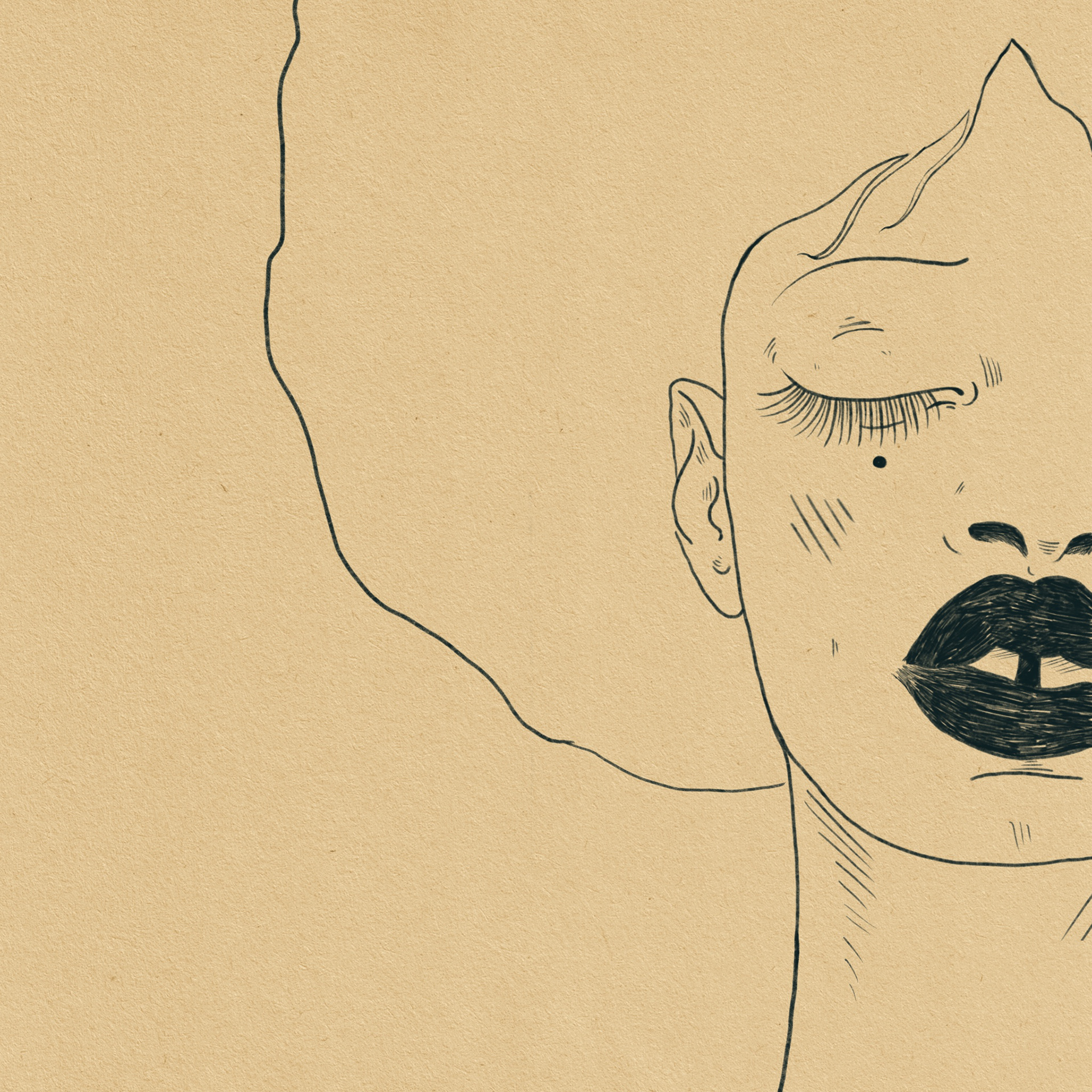
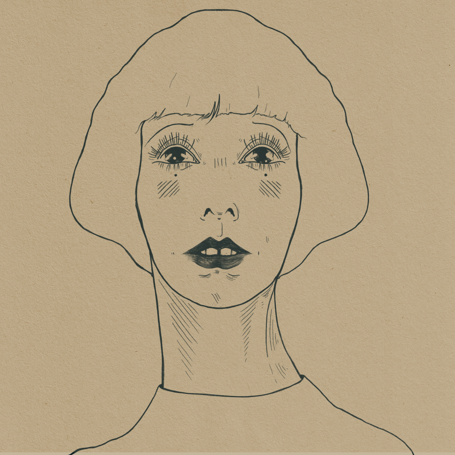
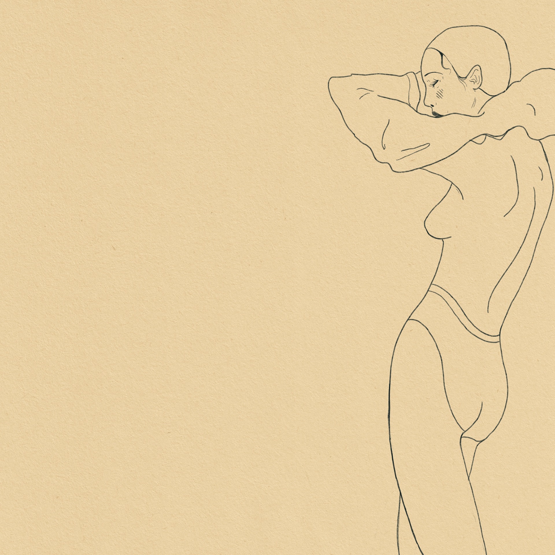
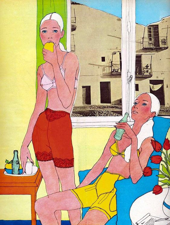
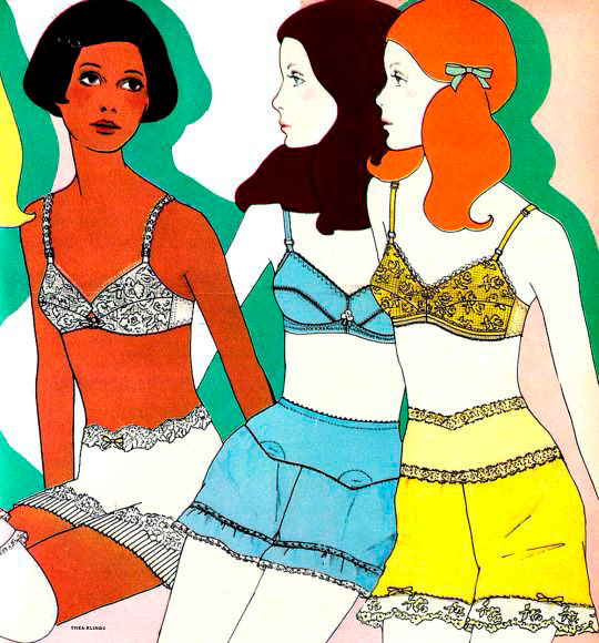
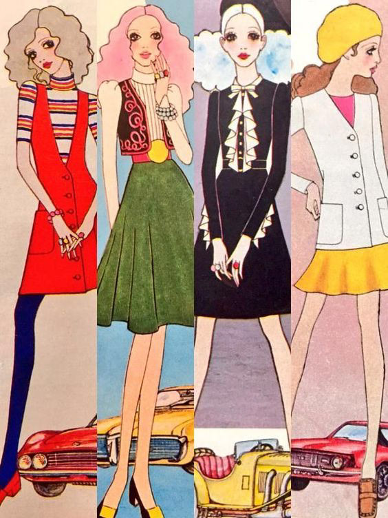
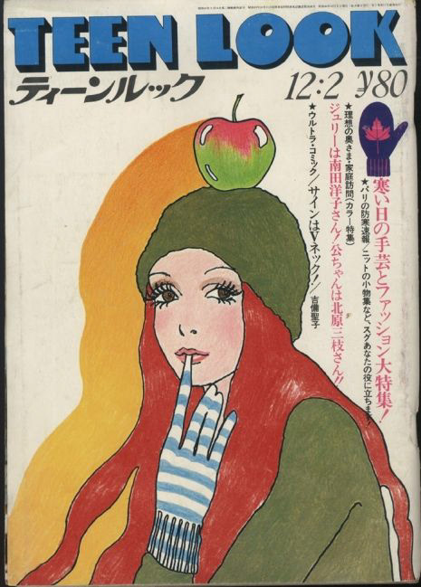
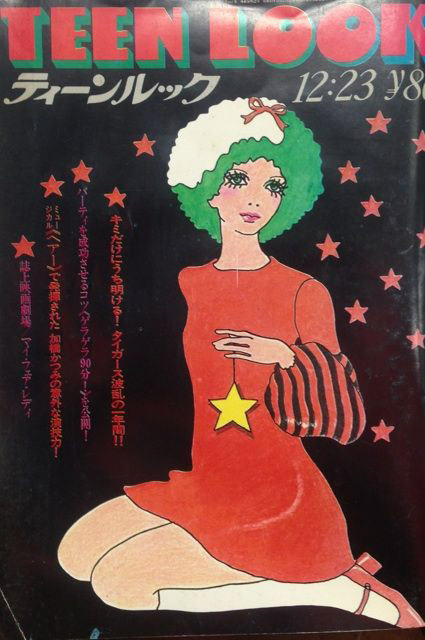
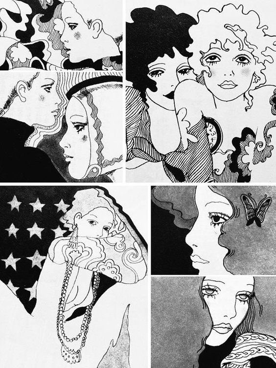
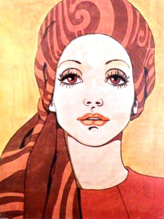
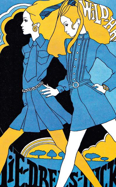
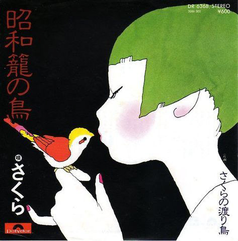
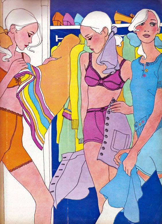
Inspiration for this work. As an illustrator, I am always on the look out for inspiration. I started to see some of this work when I traveled in Japan and upon returning started gathering as much of it up as I could.